♥
Hey Zengarmy,
Have you ever wondered why some Instagrammers are so impeccable —
that as you scrolled down their feed, you realize every single photo that
they've posted on their account is colour coordinated with one another?
Coincidence? I'm afraid not. The trick is that they planned what photos
to post before they post a photo. Now, if you're reading this & be like :
"What?! I post what I want, bitch.
Stop telling me what to post!"
Then this blog post is probably not the one for you.
However, if you would like to explore the tricks on
how to create Instagram aesthetic for your account,
here are a few tips & step-by-step guide that I've been
personally using & finding it working pretty well for me!
Ready? Let's turn to Chapter One ......
So, what does aesthetic mean?

Instagram aesthetic is a pretty personal thing, in my opinion.
It is definitely a self-exploratory thing which differs for everybody.
There is no foolproof guarantee that if you stick to a certain formula,
you can garner all the likes and comments and followers that you want.
Remember, nothing worth having comes easy! The only reason I'm writing
this blog post is because so many of you guys are requesting me to do it :)
So please don't take this post as me trying to blow my own trumpet on how
much of an Instagram guru I am. No. I'm not even close to a social media
strategist. All I did was paying attention to what others are doing, which
I'm pretty damn sure everybody else can do that. You just need a reminder.
On the side note, I actually published a very similar blog post last year, and
most of you guys seemed to really like it! I'll link the blog post down below :
HOW I EDIT MY INSTAGRAM PHOTOS? (2015 EDITION)
Okay so in this blog post, I'm not going to be all generic & say generic stuff
like "oh just post whatever you like because it's your Instagram & your rule!"
because gurl let me tell you: Instagram aesthetic doesn't quite work that way.
In order to simplify things to the maximum, I'm going to divide this blog post
into two main subtopics, which consists of (1) positioning, and (2) editing.

PART 1 : POSITIONING
Creating an Instagram aesthetic requires a lot of pre-planning & imagination.
You can, of course, not pre-plan your photos before posting them, but chances
are, they'll not coordinate with one another & you ended up deleting them all.
I recommend taking a lot of photos from different angles at the same location,
because in that way, (a) you don't have to worry about not having enough photos
to post, and (b) you can choose the best angle among the best angles to post.
Sticking to an Instagram theme doesn't necessarily mean that you're only allowed
to take photos of a specific object like flowers, human portrait or architecture.
It simply means that you do not post extremely different things side by side.
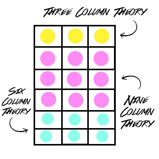
Okay, so, imagine the columns above as your Instagram feed.
There are a lot of types of Instagram aesthetics that you can create.
Some choose to use one and only one type of Instagram aesthetic
throughout the entire feed, which takes a lot of determination.
For this type of approach, for example, if you chose to post only
white-themed items like white bed sheets, white shoes and etc,
YOU CAN NEVER EVER POST A NIGHT TIME SCENERY PHOTO
REGARDLESS OF HOW BEAUTIFUL THAT SCENERY IS BECAUSE
IF YOU POSTED THAT PHOTO YOUR ENTIRE AESTHETIC WILL
BE RUINED & YOU CAN EITHER CHOOSE TO RESTART OR CRY.
Which is exactly why I don't take that approach to my account.
By the way, a cheeky self-promo here, I'm @zengteck on Instagram!
You can go ahead & follow me on Instagram if you want, but no pressure.
The approach I'm using on my own Instagram account account is a
combination of three, six, & nine column theory, which means that I
don't limit myself to using one & only one type of Instagram aesthetic.
But wait, I thought you said Instagram aesthetic = sticking to theme?
Yes. It's hard to explain in words, that's why I'm going to show you this:

I used an app called VSCO Cam (which I'm sure most of you guys know)
to not only edit my Instagram photos but also pre-plan the position of
where each of my photos will be place on my Instagram feed. Yeap, it
looks like a lot of effort but it does save your time in the long run.
So, I basically upload the photos that I've finished edited onto VSCO
before posting it on Instagram, just to make sure everything looks
aesthetically pleasing & coming together as a whole package rather
than individual photos that do not fit each other in terms of colour.
The bottom three photos are what I called the three column theory.
I took all three of these photos in the exact same location, but I spiced
things up by changing the angles and adding sticker touch-ups to them.
Moving upwards, the next three photos are also the three column theory.
I applied the same filter so that they project the same kind of vibe in unity.
Next up, it's the six column theory. You'll notice how I gathered six exactly
different photos together and made them colour-coordinate with one another.
I incorporated the elements of shadow & yellow tone into these six pictures.
FYI, I didn't plan to put these six together as a six column theory when I was
taking each of them. In fact, I just simply undergo the process of trial & error
until I found the best from all of the photos that I've taken. It's kind of like
playing the puzzle game, where you build an entire image from millions of
small, different, scattered puzzles in your gallery. Puzzle lovers will know this.
By now you should have already known that creating a theme is not just about the
object alone. It is a combination of overall colour tone (whether it's cold/warm),
the texture of the photos (whether it's shadowy/bright/grainy/overexposed), and
basically a million other aspects in terms of photography, which is not necessary
for beginners (including me, chill). People who think photography is just about
taking photos and photoshopping them? It is not as easy as you can imagine.
Besides, it is also important to know that you CAN delete pictures from a long
time ago that you think doesn't fit in to your current aesthetic. Don't make the
assumption that your visitors will not scroll till the end of your feed because
as crazy as it sounds, some of them ACTUALLY DO CRAZY THINGS LIKE THIS.
I call this self-rebranding, instead of trying to delete your awkward past.
Here are some scientifically proven theories of what you should post on Instagram,
according to this study by Curalate on over 8 million photos posted on Instagram.◉ High lightness generates 24%
more likes than dark images.
◉ A high amount of background space generates 29%
more likes than those with minimal space.
◉ Images featuring blue as the dominant color generate 24%
more likes than images that are predominantly red.
◉ A single dominant color generates 17% more likes
than images with multiple dominant colors.
◉ Images with low saturation generate 18%
more likes than those with more vibrant colors.
◉ Images with high level of texture generate 79%
more likes than those without.
Pretty amazing, isn't it? It’s so helpful to see those statistics.
Having said that, you don’t have to stick to what statistics say “works”.
If you don’t love the aesthetic you choose, it will be hard for you to keep it up.
So if you’re attracted to dark photos, stick with that, regardless of the statistics.

PART 2 : EDITING
When it comes to editing, it actually all boils down to choosing
the correct editing apps/tools & working out a formula on how
you would tune & filter the photos that you've already taken.
I don't actually recommend taking photos straightaway using
the Instagram app because sometimes capturing images in a
square form can limit your creativity. I always take my photos
using my phone camera (or better if you have a nice camera)
just because you can take your time to capture everything &
don't have to worry about fitting everything in that square.
On the side note, Instagram had updated their system long
time ago, that you can now post both rectangular & square
photos at your wish! It was a little bit hard to get used to
that in the beginning, but now I'm totally digging it, tbh.
Here are all of my currently used photo editing apps,
we all know that one photo editing app is not enough.

I've seen crazy people with 25 photo editing apps on their phone,
so I guess 8 photo editing apps is considered decent in comparison.
If you're an old reader of mine, you'll definitely notice that nothing
much has changed since my last Instagram tutorial post last year.
Most of the apps here had already been reviewed in my tutorial
last year, so I'll be only focusing on those apps that I haven't get
to review — which are VSCO Cam, Snapseed, Glitchr, & InstaShot.
[ VSCO Cam ]
I know VSCO Cam is like the most basic photo editing app (ever!) for iOS users,
but for Android users, discovering VSCO Cam is like a dream finally coming true.
It's only been a year since this app has been made allowed on Google Play Store,
and before that? VSCO Cam was nowhere to be seen! I seriously cannot imagine
my life now without this app! I edit every each of my Instagram photos using
this app & use it to envision how I would position my photos on my Instagram.
I will run through a few functions on this app with those of you who're new :
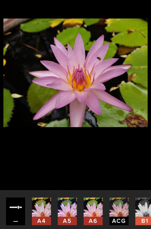
▲ This is how the original photo looks like before editing.
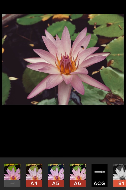
▲ After using my favorite filter #1 : ACG
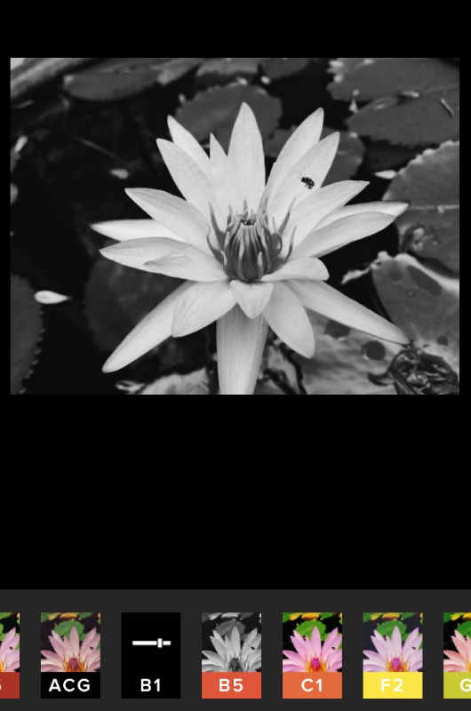
▲ After using my favorite filter #2 : B1
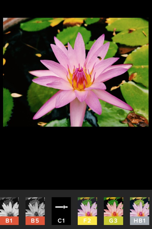
▲ After using my favorite filter #3 : C1

▲ After using my favorite filter #4 : HB1
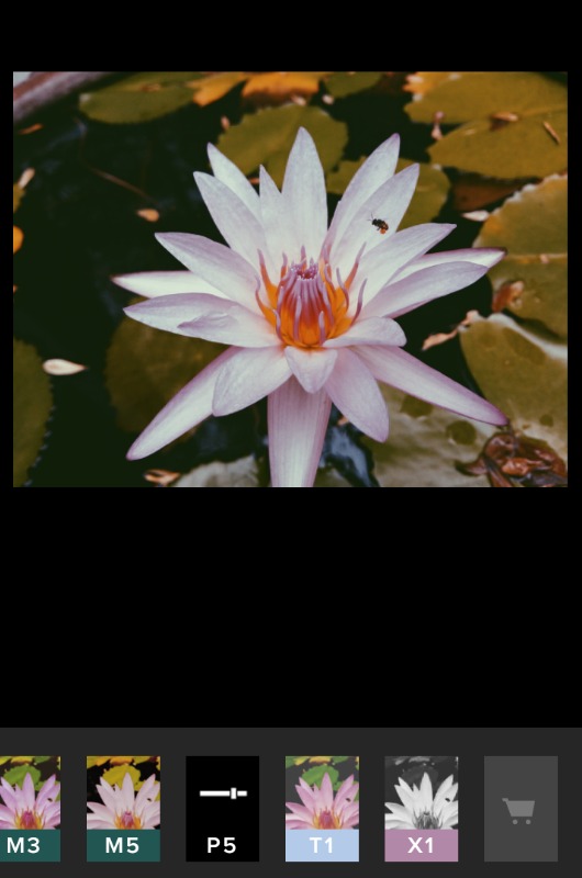
▲ After using my favorite filter #5 : P5

▲ After my routine #1 : adding exposure. (brightness catches eyes)
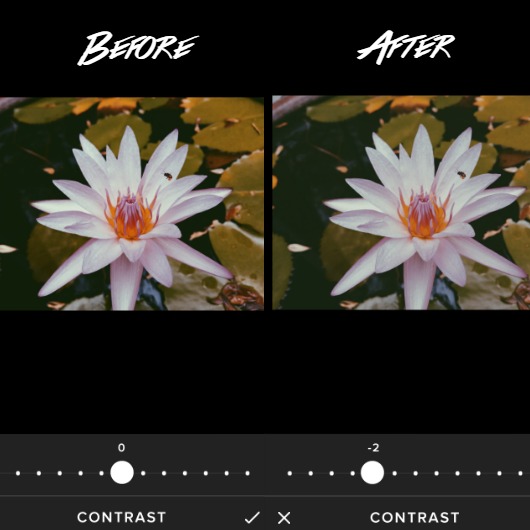
▲ After my routine #2 : reducing contrast. (creating softer look)
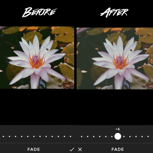
▲ After my routine #3 : adding fade. (creating ethereal look)
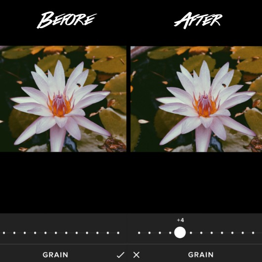
▲ After my routine #4 : adding grain. (giving more texture)
[ Snapseed ]
To be honest, I only downloaded this app recently and haven't get the
chance to fully explore every single function on this app. But I scrolled
through the functions available on this app & found it really professional!
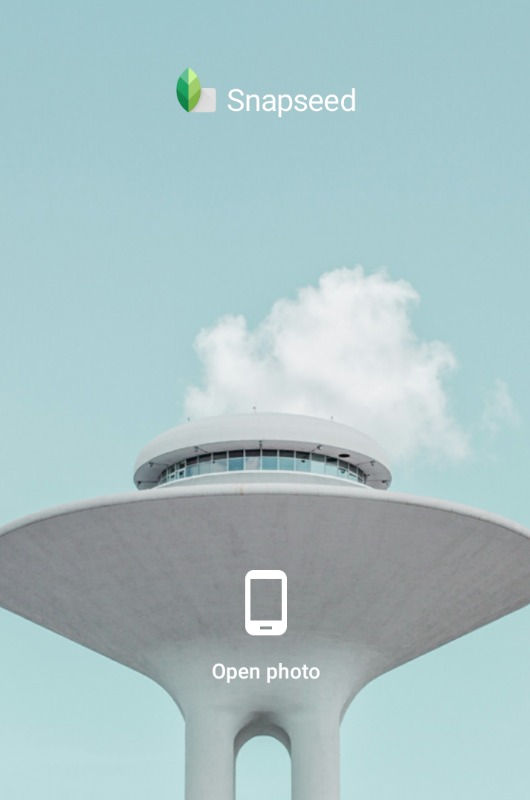
▲ Aesthetically pleasing homepage!

▲ After opening the photo, edit the photo. (obviously)

▲ Available tools. I tried some of them & they're good!

▲ Available filters. My current favorite is Lens Blur!

▲ Applying Lens Blur, like a pro.

▲ After applying Lens Blur. Can you notice the difference?
[ Glitchr ]
As the name of the app suggested, it provides distorted effects
on your pictures. Some may hate, but I'm kinda into these effects.
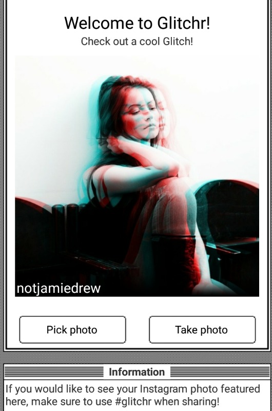
▲ Homepage.

▲ Before any effect is applied.
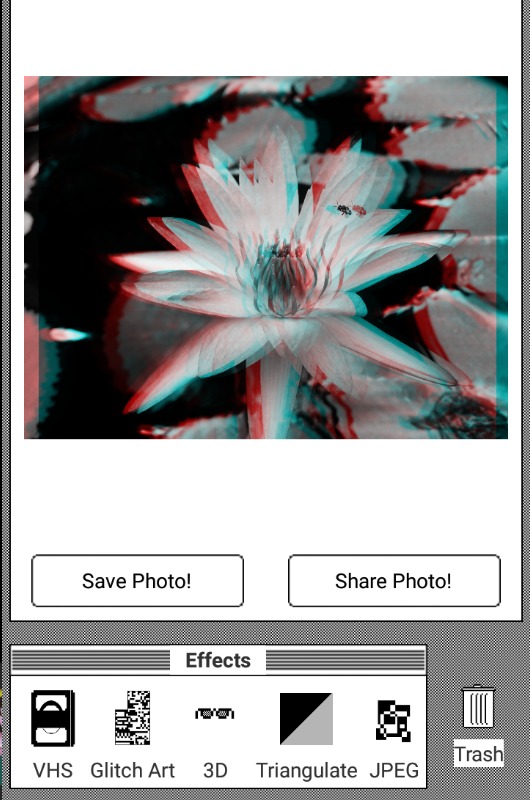
▲ After applying the 3D effect.
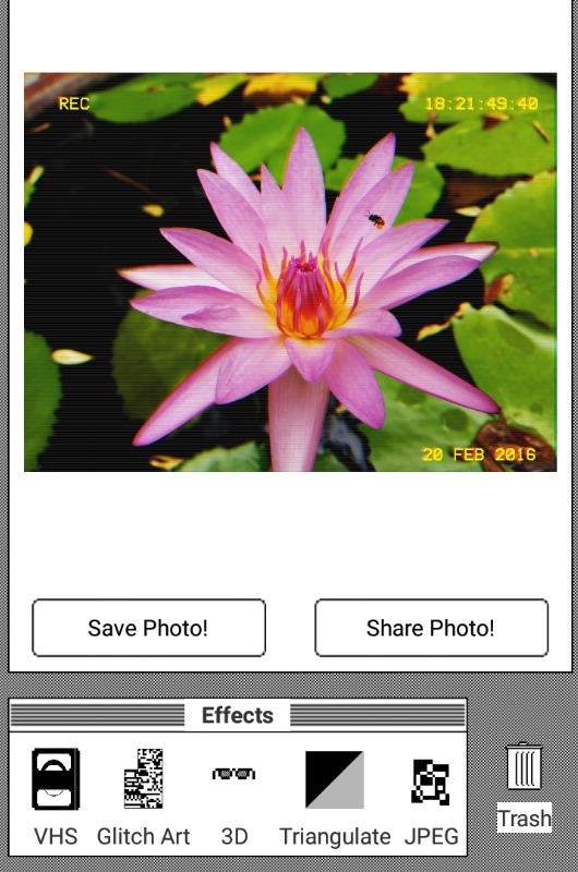
▲ After applying the VHS effect.
[ InstaShot ]
▲ Minimalism homepage.
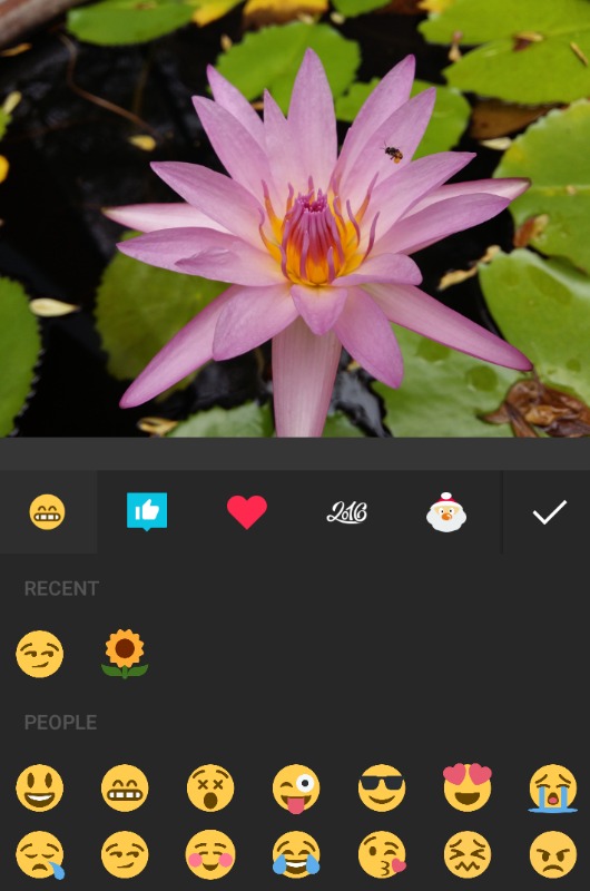

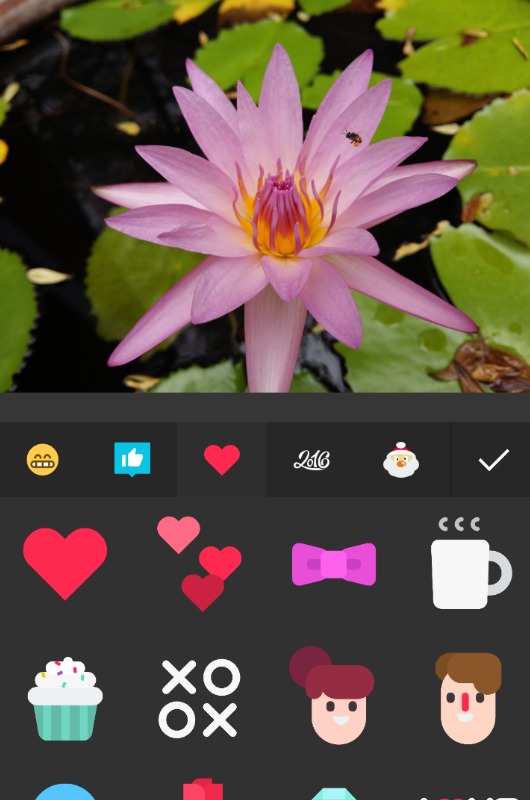
▲ Emoji lovers?! NOW YOU CAN SCREAM!!!

That will be all for now! I hope this blog post answers some of your questions!
Let me know in the comments if this post is helpful in helping you kickstart your
journey towards The World of Instagram Aesthetics, & I'll see you in my next one!
♥

(CLICK TO FOLLOW ALONG & STAY UPDATED)


0 nhận xét:
Đăng nhận xét